User Research

Introduction

When creating a new product, it is important to develop a process to gain insights into your target audience and refine your product strategy to create user-centric solutions.

This article outlines a plan to systematically engage with users, to understand their needs, behaviors, and pain points. Executing this plan will ensure your product resonates with users, solves the correct problems, and will thrive in a competitive market.

There are 3 phases to this process, and you likely will iterate through the entire process multiple times, as you develop your learnings. This article outlines the important tasks in each of these efforts:

  1. Planning and Preparation

  2. Data Collection and Analysis

  3. Application and Iteration

Let’s dig into each of these phases to understand how they collectively shape the trajectory of user-focused product development.

Phase 1: Planning and Preparation

The initial phase of user research starts the journey into understanding user needs and preferences. You will define clear research objectives, identify your audience, and establish the roadmap for engaging with them.

Define Research Objectives

Setting clear goals is important in any project. Make sure to spend time identifying them, and writing them down.

  1. Define Goals: Clearly outline the goals and objectives of your research.

  2. Clarify Research Output: Define the specific information you aim to collect?

  3. Understand User Needs: Understand the specific user needs, pain points, preferences, and behaviors you are going to focus on

  4. Identify Target Audience: Identify the demographics, behavior and characteristics of your users. Focus on specific personas, and gather insights from the right people.

Create a plan

With your objectives, and target audience in mind, create a plan to perform the research.

Depending on research constraints, you will need to decide which research methods to use. There are a variety to consider, including interviews, surveys, usability testing, observations, and focus groups. Once you have identified the methods you will use, you will need to develop materials, and figure out how to find research participants.

  1. Develop Research Materials: Document the interview scripts, survey questionnaires, usability test scenarios, or focus group discussion guides to ensure consistent research.

  2. Participant Recruitment: Determine how you'll recruit participants who match your target audience criteria. Decide whether you'll use social media, networking, or other methods to find them.

Phase 2: Data Collection and Analysis

At the heart of the user research process is the data collection and analysis process. Here you will engage with the target audience through various research methods, gathering both qualitative and quantitative data. This phase includes meticulous observation, listening, and recording of user interactions, opinions, and behaviors. The collected data then undergoes rigorous analysis to identify patterns, trends, and insights that will inform the product design. Thorough analysis will help you gain a deeper understanding of user perspectives and pain points, which will serve as a compass for refining product strategies.

  1. Perform Research: Conduct interviews, surveys, usability tests, or focus groups as planned.

  2. Gather Data: Systematically collect data during the research process. Take notes, record interviews (with consent), compile survey responses, and capture observations. Ensure data is well-organized and accessible.

  3. Analyze Data: Analyze the collected data to identify patterns, trends, and insights. Look for common themes, pain points, and opportunities that can guide your product development decisions.

  4. Synthesize Findings: Summarize key findings from your data analysis. Create user personas or profiles that represent different segments of your target audience. These personas will serve as a reference for making user-centric decisions.

Phase 3: Application and Iteration

This phase transforms research findings into tangible enhancements, forging a strong connection between the product and your users. You will use insights to guide the development and refine your product. Effectively translating your knowledge into actionable output, you align the products with user needs and preferences.

  1. Share Insights: Prepare a presentation or report that outlines your research insights, and recommendations. Share this information with your team, stakeholders, and decision-makers. Visual aids can enhance understanding.

  2. Apply Insights to Product: Utilize the insights gained from user research to inform your product development process. Make adjustments to features, design, and user experience based on the feedback and needs identified during research.

  3. Monitor and Iterate: Continuous monitoring, adaptation, and iteration are important to ensure that the product evolves in response to user feedback and changing market dynamics. Regularly conduct follow-up research to validate assumptions and ensure your product remains aligned with user needs.

Resources

There are many comprehensive user testing suites. They will provide comprehensive testing tools, and even help supply participants. A few of these suites to consider include: Lookback, User Interviews, UserTesting, and UsabilityHub.

If your work is more focused on surveys, you should explore: Airtable, Google Forms, Qualtrics, SurveyMonkey and Typeform.


Articles

American Association for Public Opinion Research - Best Practices for Survey Research

Next Steps

User research is a critical tool to help a team focus on building the right things. It is a cyclical process, and these three phases—Planning and Preparation, Data Collection and Analysis, and Application and Iteration—will help you organize and streamline your efforts to create a user-centric product that effectively meets user needs, preferences, and addresses their pain points.

From setting clear objectives and selecting appropriate methods to collecting, analyzing, and applying insights, the three phases of this process work together to inform decisions and drive improvements. User research is not a one-time activity; it's an ongoing commitment to understanding and adapting to the ever-evolving needs of the target audience. Using this process you will create strong connections with your user base and to build a product that will be successful..

After completing user research, the next step in the process is “Developing a Feature List”.

Using Live Templates to improve Android Development Productivity

One of my favorite tools in Android Studio (AS) is “Live Templates”. It is a way to create simple code templates that can be accessed via auto-complete shortcuts.

Using them is a productivity booster, since they will automate a lot of boilerplate code for you.

Using the built-in templates

There are a ton of templates already built into AS.

An example is typing logm inside a function. Boilerplate code is inserted that has the method name, and input parameter/values already entered.

Example of using the `logm` Live Template

Example of using the `logm` Live Template

Learning about the built-in templates

These shorts are only good if you know about them. It is super easy to see info about them all.

Go to Settings and search for “Live Templates”. From here, you will see various categories, and can drill down to see exact info about each template.

All the Live Templates currently available

Knowing which templates exist and how to use them is an important way to level up your tool usage, and improve your productivity.

Create custom templates

It is really easy to create your own template.

Use Case

A recent use-case I solved recently, was related to testing a project with Jetpack Compose. I needed to add the testTag attribute to many Modifiers.

The code would look like this:

Modifier.padding()
.testTag(“${TEST_TAG}${item.id}”)

It will be tedious to enter that same boilerplate on every element in my UI. There could be hundreds of locations where I will need to add that attribute. I could copy/paste but that would be tedious and error prone. Typing that same syntax over and over is tedious and also error prone.

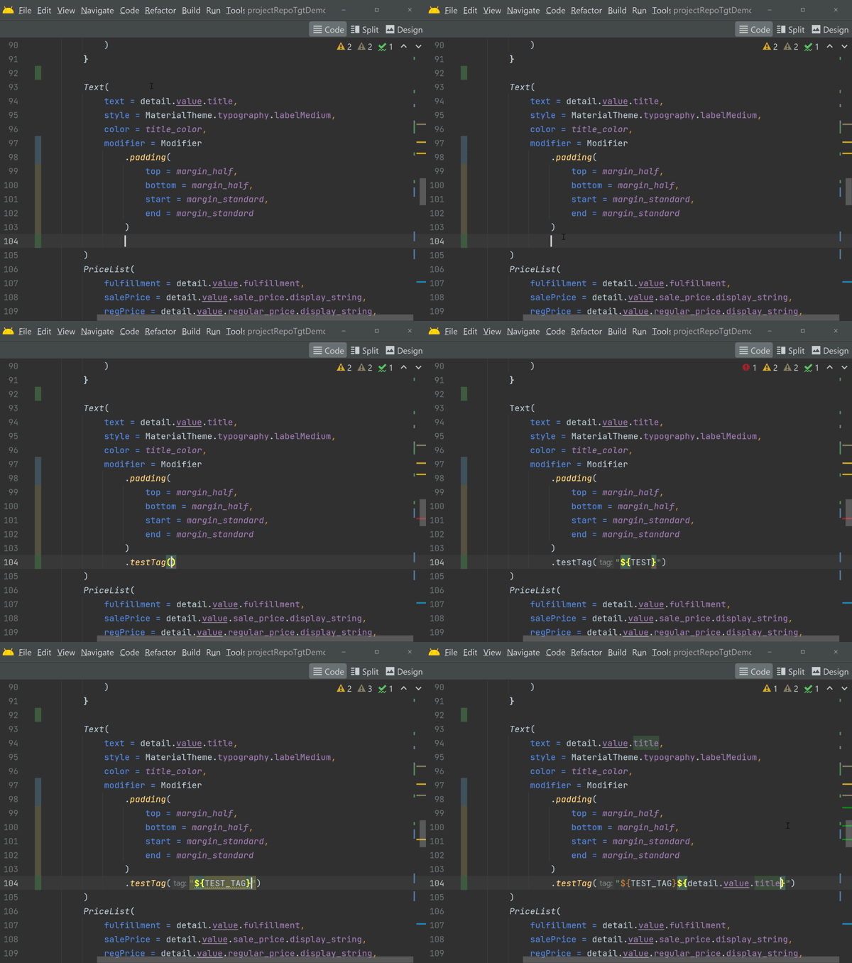
Manually typing the testTag() attribute

Creating a Custom Template

From within the same Live Templates screen we used before, you can press the + button to add a new Template.

I created a template named “mtst”, which has a single “$VAR$” argument for the value that will change with each use.

Creating a new `mtst` Live Template to add the testTag() attribute

Using The Custom Template

Now I can simply type mtst then paste the custom value for each test tag.

This is so much easier and less error prone than typing this same thing over and over!

Much quicker, particularly since I would be typing this over and over

Advanced Template Customization

There are a lot of advanced things you can do in these templates. There are many predefined functions that you can use to gather information.

A great way to discover the functions you can use is to look at the existing templates. Click the button marked Edit Variables to see how an existing template gathered info for display.

For example, the content for the logm template has this:

groovyScript(“def params = _2.collect {it + ‘ = [\” + ‘ + it + ‘ + \”]’}.join(‘, ‘); return ‘\”’ + _1 + ‘() called’ + (params.empty ? ‘’ : ‘ with: ‘ + params) + ‘\”’”, methodName(), methodParameters())

That looks more complicated than it is. It is just a line of groovy syntax that formats text based on the results of 2 predefined methods.

Sharing Custom Live Templates

Once you start using custom templates, you will realize how useful they are and will want to share your newfound productivity super power with your team.

It is easy to share your custom templates, because they are exported with the other IDE settings when you select: File | Manage IDE Settings | Export Settings

I export all my IDE settings, and store them in a Github repository. I use that repository to sync across multiple environments.

Conclusion

I hope this brief introduction to Live Templates will get you interested in using the existing templates, and creating some of your own.


Adapting a design system to work for the Metaverse

This post originally appeared on the StackOverflow Blog on Nov 8, 2021

Design systems enable developers and designers to rapidly develop products that are consistent across all platforms. Existing design standards could be directly applied in the Metaverse. But many other concepts, unique to 3D environments, required a lot of definition.

I have had great success using design systems when developing software products. They’re a great way to enable developers and designers to rapidly develop engaging products that are consistent across all platforms.

I’m advising a company enabling hybrid digital workspaces—including VR environments—and I wondered if we could extend the principles we established in our 2D design system to enable the same productivity boosts we experienced when building for other platforms.

We learned that there are many places where existing design standards could be directly applied in the Metaverse. But many other concepts, unique to 3D environments, required a lot of definition.

This article will discuss the lessons we learned when adapting our design system to guide Metaverse design and development.

High-level considerations

2D and 3D experiences both benefit from following specifications based on fundamental design principles. These constraints guide product design and development towards consistent, positive user experiences and guard against overwhelming customization.

Standards are guidelines, not strict mandates, so there were times when the existing standards didn’t fit our needs. This was okay and expected. We allowed exceptions when needed and—crucially—we made sure to clearly document the exception, so everyone involved could understand why the change was made..

Basing our Metaverse standards on fundamental design principles ensured these experiences would integrate well with our existing products. Our web, mobile, and print experiences are all developed using the same fundamental design language.

Presence

The goal in designing a good Metaverse experience was ensuring the environment felt natural, the user was comfortable in our space, and the user was able to meaningfully experience the content (instead of escaping to the real world to deal with navigation or visual distractions). The term used in VR for feeling like you are really there is “presence.” This term was first coined in Mel Slater’s theory of presence.

As Mark Zuckerberg told investors in his recent press conference for Workday: 

“The defining quality of the metaverse is presence, which is this feeling that you’re really there with another person or in another place. Creation, avatars, and digital objects are going to be central to how we express ourselves, and this is going to lead to entirely new experiences and economic opportunities.”

The goal of our Metaverse-related design specification was to establish patterns to ensure the user felt comfortable and was able to interact with the content in a natural way. We learned that we could use design specifications to enforce the illusion of self embodiment and establish interaction patterns that enforced the illusion of physical interaction.

Which 2D specifications translated directly?

We discovered many of our traditional design standards could be applied directly to 3D environments. After all, the Metaverse is still a visual medium built by code that must be implemented by developers. 

Design tokens

We created consistent, human-readable design tokens for various colors, dimensions, and typography specifications. This made the design and development process much simpler because there was a limited number of standard tokens used. These tokens quickly became the language used in our design mock-ups, allowing our team to communicate using consistent language.

By ensuring the design specifications all used the same semantic names, we reduced the likelihood that custom values would be introduced.

YES: AccentColor, SideMargin, Headline4
NO: #bada55, 16px, Montserrat/14px/Bold

Color

We didn’t support every color in the spectrum; instead, we defined a limited color palette with a more manageable number of values. We had success using just a few options tied to specific tokens.

Using a limited number of brand-specific colors drove a consistent aesthetic across all the platforms we supported. This ensured our Metaverse experiences matched our 2D or print media branding. 

Since the colors were centralized and consistent, we could easily switch them to rebrand. This control helped keep our applications accessible since we could ensure each color met minimum contrast requirements. 

However, we discovered that the limited range of colors we used for 2D designs did not necessarily translate for immersive spaces. Metaverse spaces involve lighting and appeal to our intuitive need to grasp the depth of our surroundings. We needed to support a wider range of colors for immersive environments.

Selection of color palettes needed to be done with the intent and mood of a room in mind. For 3D spaces, we used the same basic colors specified in our design system, but allowed designers to adjust their brightness or saturation. This allowed more variation, but kept the overall aesthetic consistent with our branding.

Lighting in immersive environments sets the mood, so we set minimum and maximum brightness levels to manage this. Lighting will impact text legibility and the app’s overall accessibility, so we watched it closely. We used a shorter range of soft and harsh contrasting and complementary colors to enable strong focal points when highlighting certain content.

Typography

The 2D benefits of creating a small number of typography styles translates directly to the Metaverse, and we didn’t change anything. This didn’t directly affect presence, but did make the development process much simpler.

Spacing

It was important to set our spatial system’s range with a memorable base number and document clear expectations about how it’s used. This resulted in our layouts aligning to a grid, which is visually pleasing to the user.


We used a Base8 system (allow dimensions divisible by 8). We used this because it matched up with many browsers’ base font-size of 16px (8×2), and because many popular screen sizes are divisible by 8 on one axis.

Base8 measurements are always divisible by 2, so we avoid scaling issues that result in a.5px offset that will happen in Base5 systems. Pixels with .5px offsets will display an edge that appears blurred due to antialiasing of that half pixel. 

Standard for embedded resources (videos and images)

When creating Metaverse environments, customers tended to want irregular shapes for media to fit oddly shaped spaces. We struggled to adjust our 3D spaces to accommodate uniquely shaped media. Standardizing media sizes simplified our designs so that we weren’t trying to fit an infinite number of shapes into our 3D environments.

The simplest way to constrain this was to define a limited number of supported aspect ratios:

  • 9:16 (16:9)

  • 3:4 (4:3)

  • 1:1

Ensuring all media fit one of these limited formats simplified implementation and eliminated a ton of rework since we no longer had to adjust our environments to accommodate media of all sizes. 

Which specifications were unique to Metaverse design?

We discovered a variety of design categories we used to help establish the user’s presence in the virtual world. This section will introduce the main categories we identified.

Animation

It was critical that animations obey physics and move in a natural way. This meant that objects didn’t move linearly, which looks unnatural to the human eye.

The same basic animation principles we used in other media were just as important in our Metaverse designs. We stated that all animations must use easing curves that are the correct duration (generally 200ms – 500ms).

In the Metaverse, users perceived unnatural physics much more negatively then they did in web media.

Audio

In Metaverse environments, using audio effectively was a critical part of the user experience.

Spatial

Spatial audio is reactive to the user’s position in space. In short, sound volume is a function of distance. This means the closer a user is to a content panel or another user, the higher the audio volume is.

An effective way to give the user a sense of direction is to make a louder noise come from one direction. As an example: If your friend is standing to your left and speaking to you, your left ear will hear the sound slightly louder and sooner than your right ear. Lack of good spatial audio can make an environment feel flat.

Defining this detail was quite complicated. For instance, to get good 360-degree sound, we needed to consider the shape of the room and “reflect” the sound based on this.

Ambient audio

This is a sound that plays quietly throughout the experience to establish and enforce the mood. As its name suggests, it should add ambiance, not distract from the overall experience. Ambient audio can help avoid unnatural silence when other feedback is not present.

We discovered with ambient audio, it is best to fade the audio in gradually, rather than blasting the user. When the user mutes, we prefered the audio to instantly go silent. We avoided loud audio that impeded hearing other content, and always muted ambient audio when other media was playing.

Audio feedback

We used sound triggers to guide the user in immersive environments. For example, when the user closed a door, we played a confirming sound to provide them another level of feedback. This type of feedback was often better than visual methods used in 2D design.

Avatar

How the user is represented in the virtual space directly impacts their presence. When the avatar can successfully mimic their real world movements, the experience gets even better. The user will feel more like the avatar when the movement is realistic and intuitive—enforcing that all-important sense of presence.

Limitations of avatars

Getting an avatar to successfully mimic real-world interactions is very difficult, and when it’s not done correctly, it frustrates users and takes them out of the experience. Poor digital representations can fall into the uncanny valley, giving the user a sense of unease.


If fully representative avatars were not available, an excellent compromise was to use a small profile video or image. This was a natural and comfortable extension to how users regularly represent themselves in video conferencing. We adorned the profile images with informative badges indicating location or mute status.

Navigation

When we started to discuss camera control and navigation, we quickly realized this was an exceedingly complicated subject. In fact, we decided that it needed to be its own specification, not just a section in our design spec.

We decided to define the following details:

Camera perspective 

We needed to define which camera angles our Metaverse would support. This could vary between a 1st person view, a 3rd person/dollhouse view, or a 2D overworld map. Each of these perspectives required a lot of detailed description.

Control layout

We needed to define how the user controlled the camera and their movement within the environment.

We quickly learned that having intuitive controls was important. We discovered there are many different control mechanisms, and the “best” way varies quite a bit between users.

For example, we supported standard WASD key commands, but some users preferred to use the arrow keys or the mouse to move. These specifications were further complicated because we could not depend on the user having access to our certain controls. For example, mobile devices required virtual joysticks when a keyboard was unavailable.

Locomotion and navigation

Locomotion and navigation were important to ensuring a positive user experience. The ease with which they could move and the motion simulated as they moved was critical to avoiding motion sickness.

Littlest distance

We needed to consider how easy it was for a user to move around our environment. If it was tedious to walk from one side of the room to the other the user would become frustrated. We defined maximum distances between rooms, and prioritized how the user would flow through our environments to minimize distance travelled.

Lessons we learned

In adapting our design system for the Metaverse, we learned that many of the fundamental reasons traditional specifications work are universal and translated directly to 3D design and development.  This was not surprising, because we were using established design patterns that were well researched, so we expected them to translate well.

We discovered many additional ways to help our users feel present, and we used specifications to establish patterns to ensure our users had positive experiences.  When designing experiences for the Metaverse, we discovered it is very important to have empathy for the user, and will be critical to the success of products targeting the platform.

Android Dev Hangout is Live!

androiddevhangout.png

We organized an new community group and event for Android Developers to get together and network. The group was requested by the Twitter #AndroiDev community, and was designed to mimic the very successful "iOS Dev Happy Hour" (that org was very generous to help us with ideas and planning suggestions).

The Twitter #AndroidDev community requested this, so myself and Madona made it happen.

Our first event was a success, and I personally had a great time in my breakout session with the other folks I ended up in a breakout room with.

It is a monthly event, be sure to check our website for details about our next one:

https://www.androiddevhangout.com

Art That Moved Me: Christian Marclay—The Clock

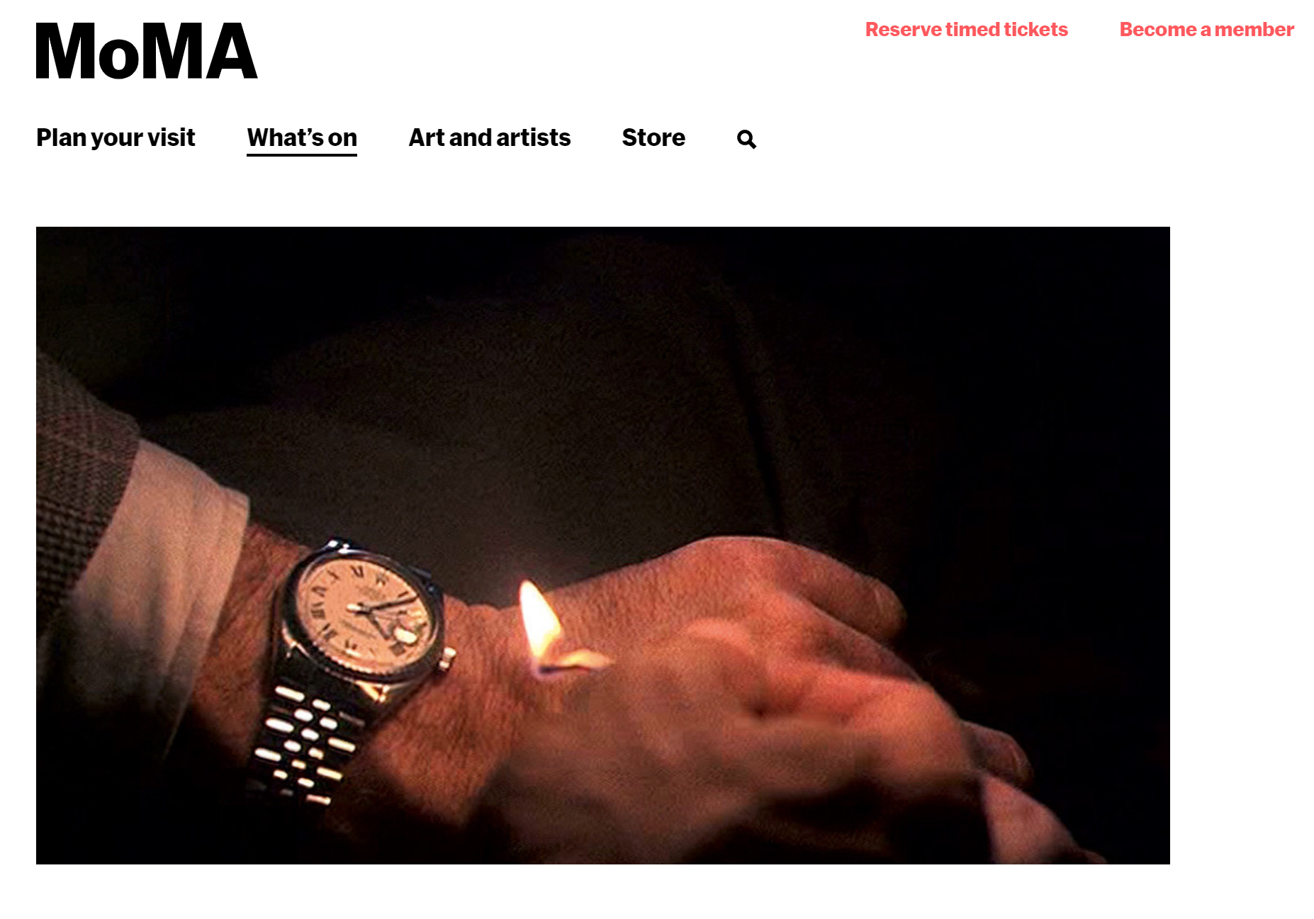
I regularly think back to this amazing piece of artwork I saw a few years ago, and wanted to capture my feelings about it. It is a 24 hour-long movie that is a collection of clips and images of clocks, timed to the time of day. It is a super interesting look at movie and TV culture and also functions as a working time-piece. Throughout the movie, the current time is displayed in various ways - maybe the LED display on a microwave in this clip, and a pocket watch in the next one. I was completely transfixed on the movie, yet still totally tethered to the current time in the real world. This installation at the SFMOMA, was being used as a count-down timer for the museum closing down for renovations (they are complete and the museum is back open). I still think about this movie all the time, and I saw it almost 10 years ago.

sfmoma.png

The Tate London describes the Clock this way:

The art is a 24 hour long looping movie that is a super clever, the website describes it as:Constructed from thousands of film clips indicating the passage of time, The Clock (2010) excerpts these moments from their original contexts and edits them together to form a 24-hour video montage that unfolds in real time.

Checkout a Clip

I found a clip of the movie available online. For full effect, and to respect the art, you should start this at 3:04. This clip is delightful, and has a lot of clever callbacks in the short 10 minute run-time. For example at 3:10, there is a scene from the Movie “3:10 to Yuma” (which is pretty obvious, but also is so much fun). I won’t give any other spoilers.

Articles from: Tate Modern and SFMoma further discuss the nuances of this artwork.

First Impressions of Android’s new ConstraintLayout

This article was originally published to Medium on May 31, 2016 · 4 min read

After Google IO, the Android GDE team got together to gather our thoughts about the most significant announcements from the conference. This is a summary of our thoughts about the new ConstraintLayout.

Some of the Andoid GDEs at post-IO gathering

Some of the Andoid GDEs at post-IO gathering

At IO 2016, one of the more exciting announcements (especially for UI focused developers) was a new layout container and tool named ConstraintLayout (CL).

It’s early days for this tool. It is currently only available from the Canary channel of Android Studio. We expect it to mature quickly (they have already pushed their first update within the first week of release). We expect that eventually this layout type will be the default used for all top-level interfaces.

ConstraintLayout View Type

High-level Constraint Layout basic concepts

High-level Constraint Layout basic concepts

On a basic level, the new CL is just another simple XML layout type. It is not much different then other layouts you are probably already using (like RelativeLayout or LinearLayout). In fact, the CL can be used just like any other layout — it can be nested into other layouts, and even be used back to API 9. It is possible to view and edit the XML, but when we asked Googlers about this, they all answered: “You can, but why would you want to?”. This is primarily designed as a visually oriented tool.

The new layout is based on Constraints. These describe relationships between your views (or the screen), in a responsive nature. These attributes are very similar to the ones used with RelativeLayout (such as: android:layout_alignParentBottom=”true”).

If CL was just another layout container, there wouldn’t be too much to be excited about. But, CL is much more then just another layout type. It is an all new layout container designed to help developers create complex layouts that are optimized to render quickly. This is because it generates flat view hierarchies (read this article to review why this is important). This will really help developers create apps with complex interfaces, that get displayed quickly and without visual jank or pauses, that consume minimal memory resources. #perfmatters ;-)

This should get rid of the newbie question of “What layout should I use here” which the answer comes from experience (and failure). There is now a top level container that is designed to be the main one everyone should use always

ConstraintLayout Editor

In addition to the new layout type, there is also an all new visual editor to make creating these new layouts easy. The visual editor is intended to be the main way developers interact with their layouts. We aren’t going to cover usage of this tool in detail, because Rebecca already did a great job in this article, and there is documentation.

This is primarily designed as a visual tool, that was re-written from scratch, and is not an evolution of the existing visual editor

The new visual editor is interesting and fun to use. It consists of 3 main tools:

  • Visual Editor — shows how your UI will look on specific screens and with specific themes applied

  • Blueprint Editor — this is where people will spend most of their time, and is where a developer defines the relationship between their views

  • Properties editor — apply specific attributes to a view you have selected.

Most of the developer interaction will be done using the Blueprint view. If you have the “Autoconnect“ button enabled and drag a view (like a Button or a TextView) onto the screen, the editor will automatically create Constraints (connections to other objects or the edge of the screen). There is a nice animation displayed while the constraint is created.

It is easy to delete and re-create constraints, and there is even an “Infer Constraints” button that will guess the constraints for your entire layout. When we tried this, it worked as well as can be expected. We think developers will use this to get started then adjust the constraints to fine-tune the details.

Overall all the editor is very straightforward to use. If you are used to building UIs with RelativeLayouts, this will seem very familiar. If however, you have been nesting a lot of LinearLayouts to build complex layouts, well, shame on you, this will be a great time to learn how to build responsive layouts the right way.

Where is this all going?

It is very early days for this tool. As with all things Google we are approaching this with cautious optimism.

We welcome the day when designers can understand basic concepts of Android view layouts, and even use the tools. The possibility to export layouts from prototyping tools (like Sketch, or Adobe Illustrator) are likely to be coming (either directly from Google or from the community).

It is currently possible to import existing layouts directly into the tool. This is likely something worth doing at some point, as this should improve the overall performance of every app. At this time, we think it is wise to let this mature a bit before using this widely in production.

We were concerned about how the switch to visual oriented development will effect development workflows. For instance, how are changes to layouts tracked for code review?

The Blueprint editor shows animations when creating Constraints. They are slow, and you have until the end of the animation to stop the constraint generation. It seems like this will be tedious to watch (hopefully there is an option to turn animations off).

Conclusion

We are excited for this new UI concept, and think using ConstraintLayout will be very useful in the near future.


Android Studio is “Borked” — my checklist for fixing build issues

This article was originally posted to Medium on Jun 19, 2018 · 2 min read

asborked.jpeg

Photo by Simson Petrol on Unsplash

I recently encountered an issue, where despite my project being configured correctly (and building on my colleagues machine), I couldn’t get it working in my local environment.

I tried multiple clean builds, cloning a fresh repo, rebooting my machine, upgrading all my dependency versions, and just about everything else I could think of to solve my issue.

My issue was: the compiler would not recognize any imports from the Android Test Support libraries. I would get the error “Cannot find Symbol” for ActivityTestRule (and other essential classes). Android Studio can get into this “borked” state for a variety of reasons though.

I ended needing to clear all my system caches (I used a great script from Sebastiano Poggi), which eventually fixed my issue.

I am sharing my troubleshooting checklist in case you encounter something similar with Android Studio. Keep in mind the further down in the list you go, the more destructive the action.

  1. Make sure you have updated Android Studio, and the Gradle version in your project to the most current stable version.

  2. Backup any special environment variables or Gradle property files which your project needs/expects

  3. Clone a fresh instance of your project to a new directory

  4. Reboot Your Computer.

  5. Restart AS using the “Invalidate Cache” option
    Access this in AS from: File\”Invalidate Caches and Restart…”

  6. Clear Project Cache — there are 2 hidden directories in the main level of your project (after your first compile). Hint: on Mac type “cmd-shift-.” if you don’t see these files in your Finder window.
    Delete both the directories:
    <project home>/.idea
    <project home>/.gradle

  7. Delete the system Gradle cache:
    Delete this folder:
    /<userhome>/.gradle/caches

  8. Refresh your project dependencies manually during build
    Use a gradle command similar to :
    $gradlew assemble — — refresh-dependencies

  9. If none of these steps fix your problem, use the “Deep Clean” method . Execute this script:
    Warning, this is the last step for a reason. If you run this script, it will reset all of your Android Studio caches, and will make your future builds slower (until the caches recover).
    https://github.com/rock3r/deep-clean
    Edit: there has been an update to this script to v1.5 since this article was released!

It can be frustrating to experience Android Studio build issues. I hope these steps will help you recover quickly.